So what is the secret to creating professional, effective web designs? While there could never be one single technique that solves every problem, studies have shown that the “F” pattern layout may be the most powerful tool professional designers have in their arsenal. The effectiveness of the “F” is based around how viewers read web content.
Eye Movement and the “F” Pattern
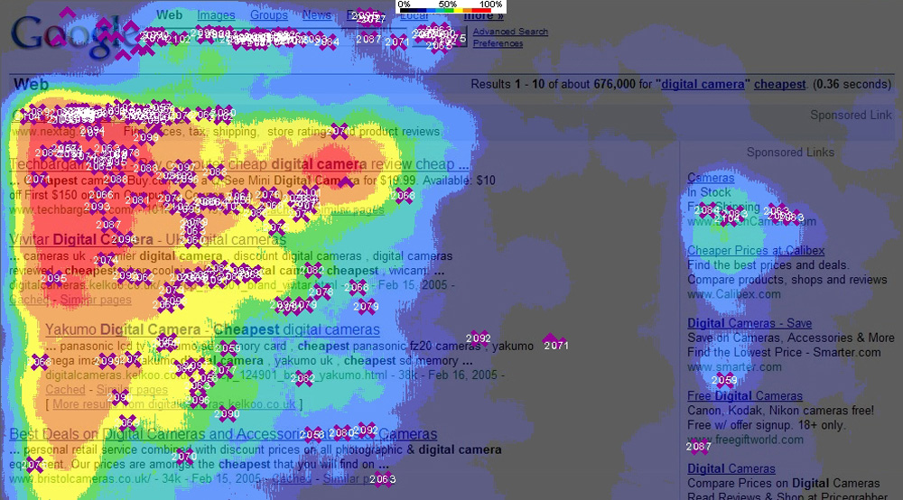
Our eyes move across webpages at incredible speeds, and studies have shown that they move in a fairly consistent pattern that is very different from what most people would assume. This dominant pattern looks a lot like the letter “F.”
![]()
When a webpage first appears on a user’s screen, the user’s eyes immediately move horizontally across the top section of the content. Then, the eyes move down vertically before reading horizontally a second time. This second horizontal movement of the eyes is typically shorter than the first one. The user reads slightly less material, or spends slightly less time processing content on this second step.
Finally, the eyes move down the left side of the content. Some users spend a fair amount of time systematically scanning this portion of the content (creating a solid stripe in the eye-tracking study above), while others move quickly through it before moving on to the next page.
Every user has a slightly different scanning pattern, but in general, almost all of them roughly resemble an “F.” The most-viewed areas of the webpages in the heat map images above, highlighted in red, clearly show the “F” reading pattern.
Why Does it Matter?
Since the goal of a webpage is to communicate content as effectively as possible, the “F” pattern plays a major role in professional web design. It shows that users simply do not read all of your content word-by-word. In fact, it is extremely rare for a viewer to read all of the text on a webpage.
This dominant reading pattern also tells web designers that, to get the intended message across, all of the most important content must be included in the first two paragraphs. Some users will actually read this portion word-by-word as intended. However, most will read only a portion of the second paragraph.
The “F” pattern also proves the importance of placing essential content within bullet points and sub-headings. During the final step of reading, most users will pick up on content placed down the left side of the content, especially if it is marked to stand-out with a symbol or darker text colour. Studies show that viewers are much more likely to read the first two words of the content in the lower areas of the page than they are to read the third.
Web design is all about communicating the intended message to the target audience, so the eye-movement pattern of the audience is extremely important. Without a good understanding of the “F” pattern, your message may be only partially communicated, and the overall web design will be far less effective.


Leave A Comment
You must be logged in to post a comment.