We have all been to websites with fancy graphics and pop-ups, extravagant colours, and an endless maze of links to other pages. You have probably been to one today.
When you are building a website it is tempting to include all of these eye-catching features to make your website “cool” or memorable. But is that what is best for business?
Well, it depends, but most of the time the answer is NO!
A graphic feature of a website that may seem appealing to the business owner or person building the website may be distracting to someone visiting the website in search of important information. Highly complex sites are likely to lose visitors quickly if they cannot easily access the information they are seeking.
Perhaps most importantly, search engines such as Google are favoring more and more sites with simple, yet high quality content. Websites with lots of ads and fancy features are appearing further and further down in the search results.
Free yourself!
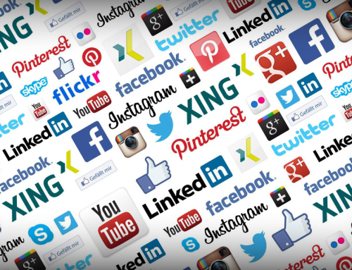
Pop-ups? Get rid of them. More than two or three of the most important social media “share” buttons? Get rid of those, too. Obtrusive prompt to “subscribe,” “follow,” or any other action? You get the point…
You should seek to get rid of anything that does not contribute to the very simple function of your website or to the content itself.
People are spending less and less time on websites, so make sure that when they visit yours, they are digesting the content rather than closing pop-ups and ads and navigating other distracting features.
KISS your website
Keep It Simple, Stupid!
Yes, your computer has hundreds of fancy fonts. Cursive. Calligraphy. Many others.
More important than looking unique is being readable. Make your font is simple, large, and stands out from the background.
Speaking of backgrounds, minimise the number of colours on the website, period. The majority of the page should be one colour or one non-distracting background image. Other colours should only be used to highlight important things such as your navigation bar or contact information.
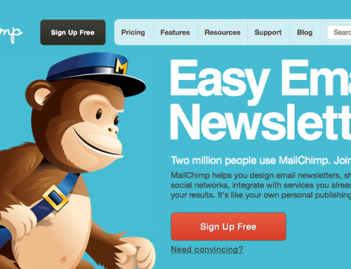
Your navigation bar should be easily found and used. The most effective style and location is a horizontal bar at the top right of the page where it does not get in the way of the important content. A vertical bar on the left side of the page is also a good option.
Is the empty space on your page driving you crazy? Good!
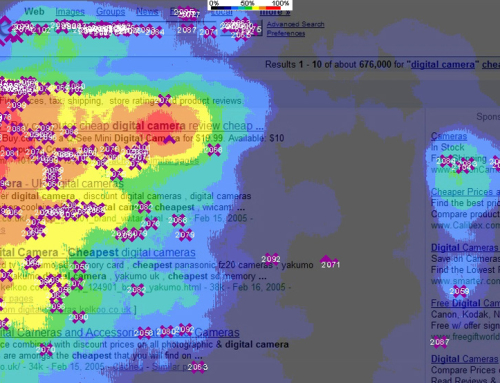
Don’t succumb to the urge to fill all of the space on your page. Negative space actually helps direct the website visitor’s attention to the most important thing, the content. Features such as side bar images, quotes, links or other features distract the reader from the main article or information.
Give your audience the information they need in the simplest, most effective manner possible. Make sure that Google not only can find you, but also that it wants to find you. And Google likes simple.
What simpler website is there than Google itself?
Leave A Comment
You must be logged in to post a comment.