Although letterpress and screen printing might be good options for producing a few copies of a design, offset lithography printing represents the standard for mass production. This printing process works well when the designer understands how to work with its colour producing capabilities. Otherwise, the end result will most likely be mass quantities of dull, poor-quality designs and a lot of wasted money.
Colour Modes
The offset lithography process utilizes four basic colours: cyan, magenta, yellow and black. This system is typically referred to as CMYK. In order to make this system work properly, the designer must ensure that every single design element is in CMYK format (not RGB). RGB is another type of colour system that provides a greater array of hues for online projects. If any of the elements in a design are left in RGB format when sent to print, the colours will be converted to CMYK and will not be the same as in the original design.
Different Types of Black
If you asked the average consumer, most would think that the colour black is simply the colour black. However, in the world of print design, there are actually a few different types of black. The two most common types are “plain black” and “rich black.”
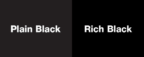
It is important to remember that “rich black” varies depending on printer preference. If a design element with any black colouration is created outside of Photoshop (plain black) and then placed next to another black element created in Photoshop (rich black), the difference is quite obvious.
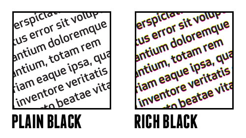
The CMYK breakdown of plain black is typically 0-0-0-100. With this breakdown, you can see that the black ink is completely saturated while the other colours are not used at all. Rich black represents some variation of colours that look black. In Photoshop, the default CMYK breakdown for black is 75-68-67-90.
If the designer is intentionally trying to make an element darker and richer in print, he or she should find out which variation of rich black the intended printer likes to use. Terms such as “warm” or “cool black” are some of the most common in this situation. “Warm black” contains higher magenta (M) levels, while “cool black” includes higher cyan (C) levels. The designer should never use a total saturation level for all colours (100-100-100-100) since this will make printing very difficult and risks over-saturation on the final print copy.
The Importance of Getting Your Black Right
Although paper over-saturation and print designs with conflicting black tones are big problems by themselves, the most damaging problem that arises from getting the black colouration wrong revolves around setting types or text. In print designs, using any variation of “rich black” colouration for the typeface can cause major problems with the final copy. It is extremely difficult for the printer to match up each CMYK separation perfectly, so it is very likely that some of the cyan, magenta or yellow colours will fall outside the font characters. This problem will make the text in the design look blurry and simply unprofessional.
Colour modes and the different types of black represent just a small portion of the many issues involved with getting the colour right in print design. A professional designer with experience in print design can help you avoid the pitfalls and complete a beautiful design.


Leave A Comment
You must be logged in to post a comment.