While there are many different factors that determine whether a logo is successful or not, logos that are especially “clever” have a better chance at grabbing your target market’s attention. To help explain the difference between clever and plain logo design, let’s take a look at a standard logo: dowjones.
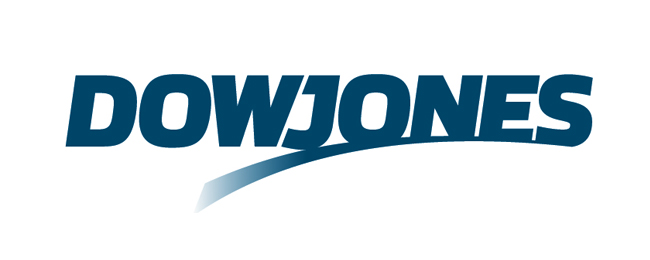
While there is nothing wrong with this logo and many would argue that it promotes the correct feeling and general effect, it doesn’t go the extra step towards being creative and unique. Truly clever logo designs invoke a unique emotion due to the brilliance of the idea and execution behind the design. These logos are curiously clever and very difficult to create:
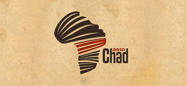
1 – Chad 2010
This logo is both simple and unique. The attractive ribbon elements provide the foundation for a great design, but its use of both a human facial profile and the continent of Africa make it stand out. Designs like this one tend to stay in the consumers memory for longer than more basic logo designs.
2 – Bipolar
When it comes to clever, the Bipolar logo may take first prize. A logo design like this one’s makes it look easy! However, creating a design like the Bipolar logo takes a different perspective and a lot of creativity. The way these basic symbols represent the world below is purely brilliant.

3 – Inequality Records
If you can’t tell what makes this logo clever, take a closer look. The standard “equal” symbol has been slightly altered so that the bottom rectangle is longer than the top rectangle. Like the Bipolar logo, the Inequality Records logo is simple, but very memorable. Not to mention that it matches the brand name perfectly.

4 – Infinity Crime Studio
Another commonly recognised symbol has been altered to create a clever logo design in this Infinity Crime Studio logo. The infinity symbol matches with a one part of the brand name and its alteration matches with the other. Again, simplicity is not always a bad thing in design!

5 – Eveva
The Eveva logo is clever in its own way. It looks and feels like an ambigram, a word or phrase that reads the same even when flipped upside-down. However, this logo is actually not an ambigram. While the “e” and “a” are the same, the “vev” in between won’t work when flipped over. This illusion could really stick in the memory of the right target market.

6 – Country Living Dentistry
This logo for Country Living Dentistry may be the perfect example of a clever logo design. While you may not notice it at first, the white element in the middle can be either a white picket fence (symbolising country living) or part of a toothbrush (symbolising dentistry). Once you catch on to that creativity, it will be hard to forget this logo design. Many business owners make the mistake of trying to create their logo on their own. These clever logos prove that professional designers can make a big difference. A unique and memorable logo can be a powerful asset for your business!

Leave A Comment
You must be logged in to post a comment.