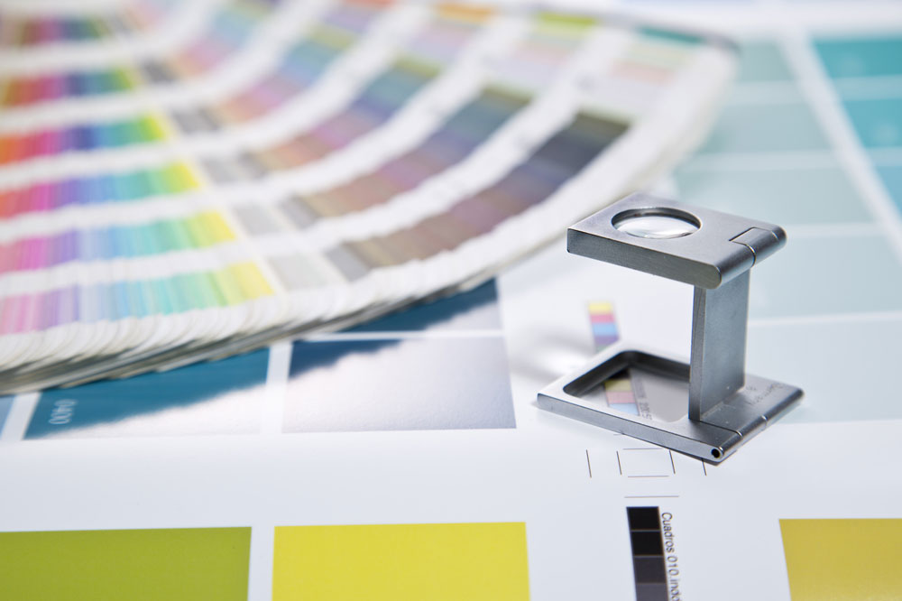
For rookie designers, projects for print can be especially difficult. There are many simple mistakes that can result in severe problems with the final quality of a print, and considering the high cost of print runs, these easy mistakes can be extremely expensive. Any designer looking to work on design for print must learn how to avoid all of these rookie mistakes and more before he can call himself a professional.
RGB vs. CMYK
Understanding the difference between RGB and CMYK colour modes is one of the most obvious mistakes a rookie can make. However, the misuse of these colour modes is also one of the most common beginner missteps.
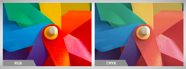
RGB stands for red, green and blue. This additive colour system utilises light to mix colours. As the designer adds light, the colours become more and more vibrant. RGB works great for digital monitors and television screens since these mediums also use light as the primary source for displaying graphics. However, designers will always run into problems when trying to use RGB for print designs.
CMYK, which stands for cyan, magenta, yellow and black, is a completely different colour system that mixes ink to create an array of different hues. As more ink is used, the colours on the design grow darker. Since RGB’s light-based system can produce a much wider range of colours than CMYK, professional print designers often utilise special CMYK modes to limit the available colours to ones that will be available when the design is actually printed.
Those who forget to use one of these CMYK modes may create a colourful design that looks amazing on a monitor display, but then realise they’ve made a huge mistake when the prints show up muted and dull.
Line and Font Weight
Modern printing presses are designed to precisely control the amount of ink placed on the paper. While this may save you some money on printing costs, it is also the reason why print designers must always consider line and font weights. To help control ink usage, the printing presses utilise a lower dot density in areas that need less coverage. This procedure results in a loss of detail and readability when the designer tries to use lines and fonts that are too small. As a rule of thumb, most professionals use a minimum of 6pt text size for print design. However, this size greatly depends on the typeface you choose.
Getting the Resolution Right
On a computer screen, altering the resolution only makes your image appear larger or smaller on the monitor. However, the print resolution plays a key role in the sharpness and crispness of your print designs. 300ppi represents the standard in print design, while 72ppi is typical for web images.
PPI stands for pixels per inch. Designs with higher PPI have higher detail when printed in ink. Print designers should ensure that all elements, including images, are at 300ppi. Random web images are almost always too small to make cut. You can never scale a design element UP in resolution without causing extreme blurring, so it is always a good idea to start with a set document size and work from there.
There are many more common mistakes in the world of print design, but the true professionals know how to avoid all of them. If you are not sure about any part of your design for print, you should seek some help from a professional.

Leave A Comment
You must be logged in to post a comment.