5 common brochure mistakes and how to avoid them
Putting together the perfect business brochure isn’t straightforward – you need the right message to come through from the copy, the print needs to be accurate and high quality, while you also want the photography to be up to scratch.
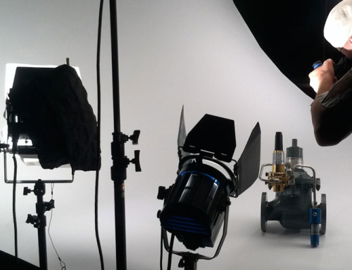
In our experience, photography seems to be one area where many of our clients struggle. It’s often misunderstood, as most people are simply happy with just a nice looking photo – but that only covers one aspect of what makes a successful brochure image.
We’ve seen countless mistakes throughout the years. These are top 5 that you really must avoid if you want your brochure to be a success!
Low quality images
When you send your brochure off to the printers, make sure your photos are at least 300 DPI at the size they reproduce. While your images may look great on screen, they will come out pixelated and shoddy if you go below this figure.
If you don’t ensure your images are of the highest digital quality, you’re going to have an expensive mistake on your hands. Brochures with low quality imagery will simply not drive sales and will reflect a company that doesn’t quite know what it’s doing.
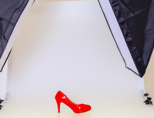
Photography that doesn’t work on print
Images that look absolutely gorgeous on your monitor don’t guarantee the same results on paper. You not only need your images to be of high quality (as discussed in the point above), but they must also work on print.
What do we mean by this? The photos need to form part of the brochure as a whole – the level of detail or zoom can look very different on paper than on a monitor. What can look subtle on your screen can often be overbearing in a physical brochure. If you’re unsure about yours, ask the printing company whether you can do a trial run before committing to an entire batch. Over time, you’ll develop a sixth sense for this!
Beautiful images that don’t make sense
Many amateur photographers can take some stunning shots that really catch the eye. However, that doesn’t necessarily mean that a given photo will fit a business brochure.
We’ve seen clients include beautiful photos in their brochures, but they simply don’t make sense. There’s no context attached to the image and it doesn’t fall in line with what the business is trying to sell.
Your photography needs to tell a story in its own right. Your potential customers need to get a hint of what your business is all about – if you’re photo is just a pretty picture, you can forget about new leads.
Photography doesn’t fit the brand
Your brochure needs to match your brand from top to bottom. We often see clients make the mistake of trying to force a certain type of photo into a brochure, simply due to liking the style on an individual level.
However, if the photo doesn’t match the rest of the brand the result will simply look unprofessional. Remember, you want your photography to be synched with your whitespace, colour scheme, typeface and overall brand message. Otherwise, people won’t take your brochure seriously.
Confused? We can help
If you’re unsure of how to tackle your product photography, why not give us a buzz for a free consultation? We have ample experience in creating stunning brochures that really show your products off – we’ve improved sale numbers for a wide range of clients in wholly distinct industry. Check out our Brochures & Folders section for some samples of our work.
Leave A Comment
You must be logged in to post a comment.