Right now, at this very moment, your brain is performing a seemingly simple task: reading. However, when you really think about it, this task is really not simple at all. Your eyes are moving across the lines and sending information to your brain. Your brain must then interpret this information. It uses past experiences, visual cues and your surroundings to put all of this information into context. Even if a thousand people read the same words, none will interpret them in quite the same way.
At some point, all of us have created something for someone else to read, but have you ever really considered the intended reader’s experience? Great design and effective typography provide an excellent, enticing experience so that the message gets across to the target audience.
What is Readability?
There is a difference between legibility and readability. You can present a group of text that can be interpreted, but that does not mean it will be easy or enjoyable to read. The emotional aspect of a certain design plays a significant role in readability. It is not whether or not your target market can read your message, but whether or not they will WANT to read your message.
How Reading Works
Novice designers often make the mistake of assuming viewers will read a print design the same way they do. While that would certainly make things easier, reading is a much more complex task than that. Someone reading a print advertisement in a busy café will probably read it differently than someone reading it with no distractions.
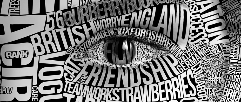
As you read, your eyes move across the page with the text. Your brain calculates on the positive and negative spaces within the typography, but quickly changes these calculations into mental imagery. This is what happens when good writing and great typographic design produce readable work. The viewer is much more likely to get your message in this scenario.
Typography: Web vs. Print
One of the advantages print typography has over digital typography involves control over the medium. Website designers have very little to no control over the device and lighting a viewer uses. That means that they have to make their typography look great regardless of viewing size, contrast or brightness.
Print designers should use this advantage to make the most out of their typography. If a designer knows the medium they will be printing on and the general environment the print will be viewed from, they can skip all the techniques web designers have to use to keep their typography adaptable.
For example, a web designer using typography on a site’s home page must make sure that his design works well with all screen sizes, but a print designer can get creative with sizes/colours/fonts and other elements to make the typography stand out on its particular medium.
Much like a toddler pressing down on the keys of a piano, simply throwing words on a piece of paper won’t ever get you the best possible success rate. In the hands of a good designer, typography can mean the difference between a few leads and thousands of new customers!
Leave A Comment
You must be logged in to post a comment.