Website design mistakes
Over the fairly short lifetime of website design, there have been some pretty big mistakes. Hopefully, we can learn from the failures of the past and grow the industry through better work. More importantly, these classic web design fails are actually pretty interesting.
The Online PDF Plague
The PDF file has been around for many years and works well in certain applications; however, online users can’t stand PDF files when browsing and reading the web. The simplest of tasks such as printing and saving become stressful because the standard browser commands don’t work. The layouts of PDF files are typically optimised for a sheet of paper, not a browser window. They often present tiny fonts and defective scrolling. In general, the PDF file makes navigation difficult and formatting stressful for most online consumers.
Navigational Nuisance
When navigating through a website and searching for information, users need to see indicators to understand their current location. By clearly indicating a user’s past and present locations web designers can make navigation smoother and easier. Links are the most important factor in the navigation process. Users like to see the links that didn’t show what they wanted in earlier visits so that they can save time. This idea is also helpful for users who want to revisit a link that was actually helpful.
All of these benefits only occur if users can tell the difference between visited and unvisited links. Most effective websites change the colour of a visited link to help users see this difference. When links don’t change colour after visits, navigational disorientation can occur and usability is significantly decreased.
Troublesome Text
One of the biggest mistakes of entry-level web designers involves their use of text. Online users do not want to see a wall of text. Large paragraphs and lengthy articles hinder the interactive experience of the site and make the design boring and painful. Designers should always focus on maintaining content specifically written for online usage, not print. Subheadings, bulleted lists, highlighted keywords, short paragraphs and simple writing style help make text more readable for online viewers.
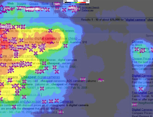
Striving for Selective Attention
Web users are quick learners. Although some pay attention to text-only search engine advertisements, online users have learned the art of selective attention when navigating the web. They easily ignore ads that don’t help them reach the information they need. Unfortunately, this same idea applies to design elements that might look like advertisements. That’s why it is so important to avoid banner-style elements, annoying animations and pop-up windows.
Anything with the shape or position of a typical banner advertisement will be ignored by most users, as will any element with flashing or aggressive-style animation. Most pop-up windows will be closed before they even fully load on the screen.
A Consistent Connection
One of the most powerful principles in web design is consistency. Users experience a more relaxing and entertaining navigation process when all elements behave in a similar way. They almost know what will happen due to their past experiences. By allowing your users to accurately predict the navigational process, the web designer makes them feel more in control of the system. This idea also applies to your consistency with other websites. If you deviate from the consistent patterns of design, your site navigation will be confusing and uninviting.


Leave A Comment
You must be logged in to post a comment.